
The main difference between the KUMO cappuccino cups is their color effect. Shape, artisanal character, and use remain similar, but Beige, Blue, Yellow, Mixed Clay, and Grey-Black significantly change the look of your coffee corner.
Overview of the variants
| Variant | Effect | Pairs particularly well with |
|---|---|---|
| Beige | warm and understated | Japandi, light kitchens, natural tones |
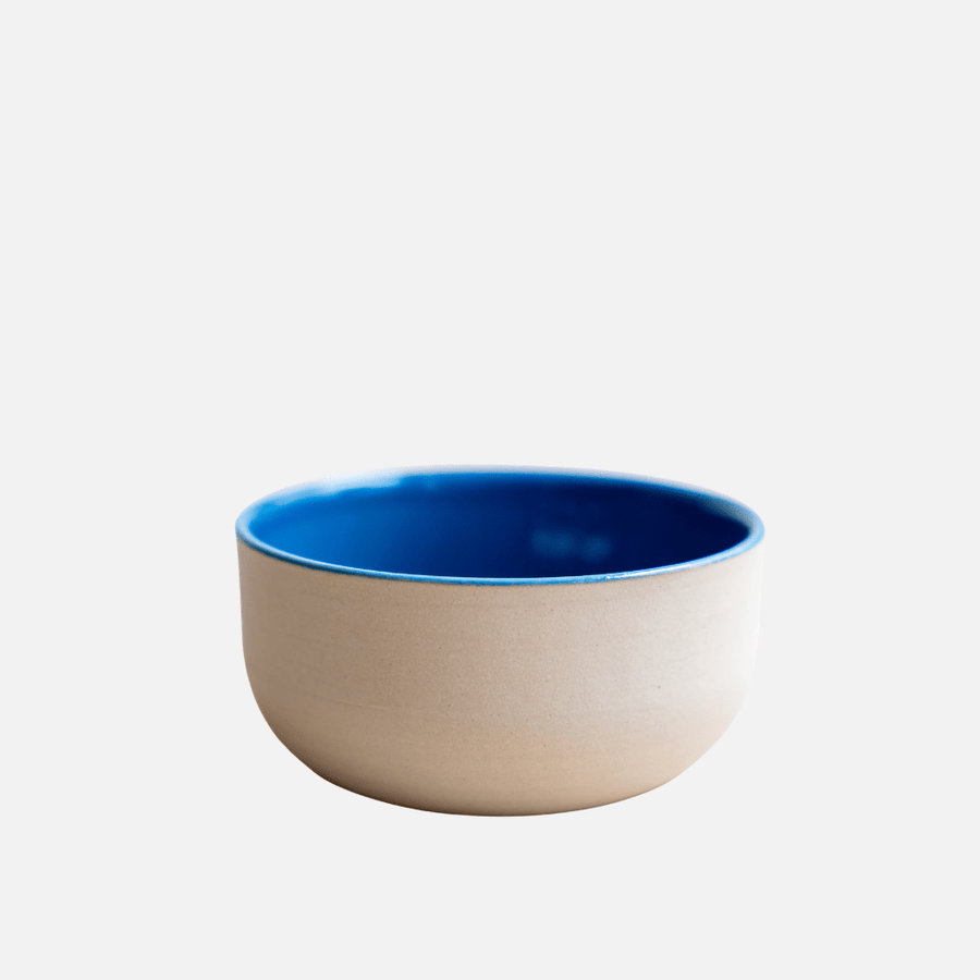
| Blue | calm and clear | light ceramics, wood, modern coffee corners |
| Yellow | friendly and warm | bright morning moments and color accents |
| Mixed Clay | earthy and artisanal | Wabi-Sabi, wood, natural materials |
| Grey-Black | high-contrast and minimalist | Minimalism and modern kitchens |
KUMO Beige: the versatile entry point
Beige easily integrates into existing table and kitchen settings. The color appears soft and draws attention to the shape, beverage, and handcrafted surface.
KUMO Blue: a calm splash of color
Blue sets a visible accent without being loud. This variant pairs particularly well with light wood, white ceramics, and understated textiles.
KUMO Yellow: warmth for the morning
Yellow brings a friendly color effect to the coffee corner. It is suitable for people who appreciate natural tones but want to add a small bright accent.
KUMO Mixed Clay: visible material character
Mixed Clay emphasizes the earthy, organic side of ceramics. The cup looks particularly harmonious with linen, wood, and other irregularly textured surfaces.
KUMO Grey-Black: clear contrast
Grey-Black suits minimalist, modern interiors. Alongside Beige or Blue, it creates a deliberate interplay of colors without needing to combine different shapes.
Single cup or set?
A single cup makes for a personal favorite item. For guests or a coordinated coffee corner, options include the KUMO Natural Calm Set, the Modern Contrast Set, and the Coffee Balance Set.
How to choose your color
- Check the existing colors in your kitchen or coffee corner.
- Decide between quiet integration and deliberate contrast.
- Consider whether individual cups or a harmonious set are desired.
- Choose based on actual use, not just the photo.
Care
Observe the care instructions on the respective product page. Handcrafted ceramics may show slight variations in shape, color, and surface. These characteristics are part of their individual charm.
Frequently asked questions
Which color best suits Japandi?
Beige, Mixed Clay, and Blue are particularly easy to combine with wood, linen, and neutral color tones.
Can I mix different colors?
Yes. Two to three coordinated colors usually appear calmer than a large, unordered mix.
Which cup makes a good gift?
Beige is particularly versatile. For known color preferences, Blue, Yellow, or Grey-Black can feel more personal.
Discover more
KUMO Coffee Rituals · KUMO Tea Ceremony · Product Finder · Atlas




Kommentare
Kurze Gedanken zählen. Wenn du magst: setz den ersten Ton – oder antworte direkt mit @Name:
Pro-Tipp: Wenn du jemandem antworten willst, starte mit @Name:
Mach aus dem Lesen ein Ritual.
Wenn dich der Beitrag gerade trifft: nimm die Stimmung mit – als Duft, Deko oder Geschenkidee.
Mach aus dem Lesen ein Ritual.
Wenn dich der Beitrag gerade trifft: nimm die Stimmung mit – als Duft, Deko oder Geschenkidee.
Passt der Beitrag zu dir?
Zur Kollektion