

Japandi • Living • Clear Forms • Natural Materials
Japandi feels calm not because there is as little as possible in the room. What matters is that forms, colors, materials, and functions go together. The interior style combines Scandinavian-inspired clarity with design principles often associated with Japanese aesthetics: reduced forms, natural surfaces, a handcrafted feel, and deliberately open space.
Japandi is not a traditional Japanese style designation, but a modern interior design term. For me, that is exactly what makes it so helpful: You don't have to copy a culture, but can apply some good design principles to your own everyday life.
What is Japandi?
Japandi describes a modern interior style that brings together two related ideas: functional, understated design and a preference for natural, visible materials. The result is not meant to look sterile. Good Japandi rooms have texture, signs of use, different surfaces, and individual personal items.
Typical features are:
- clear, simple forms
- warm natural and earthy tones
- wood, ceramics, stone, glass, and textile textures
- a few carefully selected living objects
- open space between objects
- functional items that also look decorative
- a mix of calm order and handcrafted irregularity
If you want to check first which objects even go together, the guide Choosing Decor Mindfully: 6 Rules for Calm Rooms provides a good foundation.
The Right Japandi Color Palette
Japandi rarely relies on strong contrasts over large areas. The base usually consists of muted, natural tones. White can be warm, beige can have different nuances, and gray can look stony rather than cool.
Suitable Base Colors
- cream and off-white
- sand and beige
- taupe and warm gray
- light to medium wood tones
- muted brown
Accents
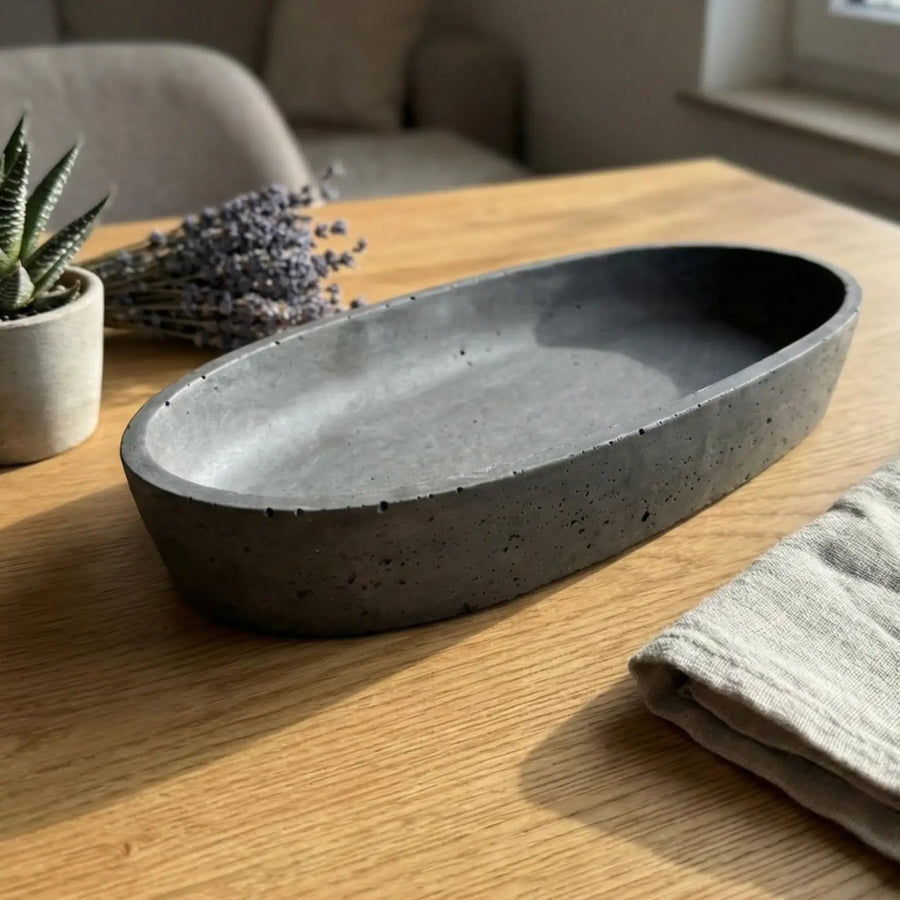
Dark anthracite, black, deep blue, or a muted green work well when used sparingly. A dark planter, a single vase, or a gray-black mug can be enough to ground a light surface.
Instead of spreading five small accent colors around the room, I would rather repeat one. A dark line in a planter, for example, can reappear in a mug or a ceramic object.
Materials: Better Fewer, But Visible
Material is more important than decorative patterns in Japandi style. A matte ceramic surface, the grain of wood, or a textured vase contributes more to the overall effect than additional ornaments.
A simple combination can consist of three layers:
- Wood as a warm base structure.
- Ceramics or stone as a calm, handcrafted counterpoint.
- Textiles, glass, or plants as a softer or livelier accent.
Too many different surfaces make a room feel restless despite neutral colors. High-gloss, chrome, three types of wood, plastic, and heavily patterned textiles are therefore usually more difficult to combine at the same time.
Japandi Decor: Open Space Is Part of the Design
The most important rule is surprisingly unspectacular: Not every open space needs an object. On the contrary. Space allows forms to look better.
On a sideboard, a small group of three elements is often enough:
- a taller vase or plant
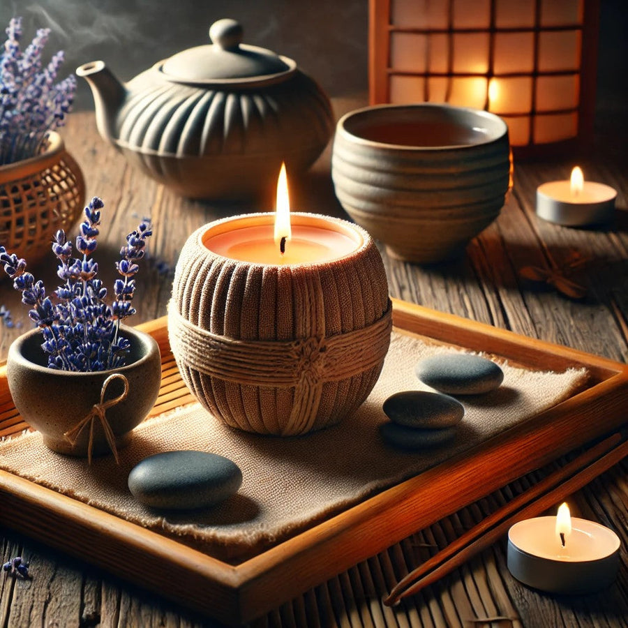
- a lower object such as a bowl or Zen stones
- a functional item, such as a mug on a small tray
After that, the space remains open. Exactly this emptiness prevents a calm interior from becoming a product display.
If you want to work with Zen stones or small meditative arrangements, you should not distribute them randomly. The post Planning a Mini Zen Garden at Home: Space, Size & Material shows how to place such elements effectively.
Japandi in the Living Room
In the living room, the large structure should be right first: sofa, table, lighting, rug, and clear walkways. Decoration comes after that.
A Simple Setup
- Determine a calm base color.
- Decide on one or two main materials.
- Do not completely fill large surfaces.
- Distribute living objects in small groups instead of individually throughout the room.
- Leave personal items visible – Japandi does not have to be anonymous.
A vase with a clear silhouette, a geometric planter, and a small ceramic group can have a stronger effect than ten similar decorative items.
Japandi in the Dining Area and Coffee Corner
Here, the style can be combined particularly well with function. Mugs, bowls, and small trays are used anyway; they do not need to be purchased additionally as pure decoration.
For a calm coffee corner, for example, the following are enough:
- two to four mugs that are actually used
- a small plant or vase
- a tray or a designated storage area
- free workspace next to it
With coffee ceramics, I would not show every shape and every color at the same time. A small selection of beige, gray-black, or a targeted color accent looks more organized.
Currently available: Costa Nova Latte Macchiato Mug (380 ml). Please note the fill volume and stock.
Matcha, Tea, and Tea as a Functional Part of the Living Environment
A tea or matcha ritual fits Japandi so well because the object has a purpose. A handmade bowl or teacup does not just sit around; it is used. The small irregularities of ceramics can therefore look more interesting than absolute industrial perfection.
A calm tea area can consist of a bowl or cup, a small tray, and a single living object. Those who want to place usage more in the foreground can combine it with the Genmaicha Ritual: Preparation, Taste & Calm Break.
Currently available: Hokuryo Tea Cup (300 ml). Please note the fill volume and stock.
The tea remains the main character. The interior style is the frame, not the other way around.
Plants in Japandi Style
Plants bring lively forms into an otherwise highly reduced environment. The same applies here: do not place as many different types together as possible. A single, well-proportioned planter can have a stronger effect than a whole row of small pots.
Work well:
- clear or geometric vessels
- matte surfaces
- natural, black, or understated earthy tones
- plants with a clear silhouette
The planter should match the size of the plant and the piece of furniture. A tiny pot on a long sideboard looks just as lost as a large vessel on a narrow windowsill.
Combining Vases and Ceramics Correctly
Vases and mugs do not have to come from the same series. A common connection through color, surface, or form is more interesting.
Examples:
- round beige mug + organically shaped light vase
- gray-black ceramics + black geometric planter
- yellow matcha bowl + a single warm color accent in the living object
The goal is relatedness, not uniformity.
The Most Common Japandi Mistakes
1. Confusing Beige with Japandi
A completely beige apartment is not automatically Japandi. Without material contrasts and different forms, it can quickly look flat.
2. Too Many Small Decorative Items
Many small objects create visual restlessness – even if each one looks minimalist.
3. Buying Only for Aesthetics
Japandi works particularly well when items are used. Mugs, bowls, planters, and vases have a clear purpose.
4. Using Cultural Symbols as a Shortcut
A Japanese-looking character, Buddha motif, or any "Zen" symbol does not make a thoughtfully designed room. Religious or cultural motifs should be used consciously and respectfully.
5. Buying Everything New
The better order is: reduce, rearrange, regroup existing items, and only then add new ones specifically.
Furnishing Japandi: My Order for Shopping
Those starting from scratch do not have to start with decoration. I would proceed in this order:
- Function: What is really needed?
- Space: Where should the object stand?
- Size: What size fits?
- Material: Which existing materials should it complement?
- Color: Base color or accent?
- Only then select the product.
This turns "I still need Japandi decor" into a concrete decision like "I am looking for a matte vase in medium height for the light sideboard."
A Small Japandi Living World from a Few Pieces
For getting started, a few well-combinable categories are enough:
- Zen stones or another low living object
- a geometric planter
- a calm vase
- a matcha bowl or tea cup
- for a coffee corner, a single matching coffee mug
Our current selection bundles this order in the collection Japandi Summer – Calm Living Worlds. There, living objects are deliberately placed first, followed by matcha and tea, and then selected coffee ceramics.
Japandi Through the Seasons
The base style can remain the same all year round. Seasonality is created through a few interchangeable accents. In spring, a vase with branches may be enough, in summer a lighter textile, in autumn a warmer ceramic tone, and in winter an additional light source.
How such changes can be implemented without completely redecorating is shown in Seasonal Inspiration: Why Decor and Scent Work in the Circle of the Year.
FAQ: Japandi Living
Which Colors Suit Japandi?
Warm white tones, beige, sand, taupe, natural wood, and warm gray form a good base. Black, anthracite, blue, or muted green can set understated accents.
Is Japandi Only Beige?
No. Material, proportion, open space, and function are more important than an exclusively beige color palette.
Which Materials Suit the Japandi Style?
Wood, ceramics, stone, glass, linen, and other naturally looking materials can be combined well. What matters is a limited selection instead of as many surfaces as possible.
How Much Decor Does a Japandi Room Need?
There is no fixed number. Small groups with two to three objects and sufficient open space often work better than many individual pieces.
Do Plants Suit Japandi?
Yes. Individual plants with a clear silhouette and understated vessels can complement the calm design.
Does Handcrafted Ceramics Suit Japandi?
Very well, if the form, color, and use suit the room. Small irregularities can emphasize the material effect and avoid a sterile impression.
How Do I Start with Japandi Without Buying Everything New?
First reduce existing surfaces, group things by material and color, and remove unused objects. After that, only add where a functional or design gap actually remains.
Kommentare
Kurze Gedanken zählen. Wenn du magst: setz den ersten Ton – oder antworte direkt mit @Name:
Pro-Tipp: Wenn du jemandem antworten willst, starte mit @Name:
Mach aus dem Lesen ein Ritual.
Wenn dich der Beitrag gerade trifft: nimm die Stimmung mit – als Duft, Deko oder Geschenkidee.
Mach aus dem Lesen ein Ritual.
Wenn dich der Beitrag gerade trifft: nimm die Stimmung mit – als Duft, Deko oder Geschenkidee.
Passt der Beitrag zu dir?
Zur Kollektion